深圳改革开放展览馆
Shenzhen Reform and Opening-Up Exhibition Hall
扬帆踏浪
你,问起明天和梦
光,指向大海和远方
Sails at Sea
You ask about tomorrow and the dreams,
the light points to the oceans and beyond.
概念和设计出发点
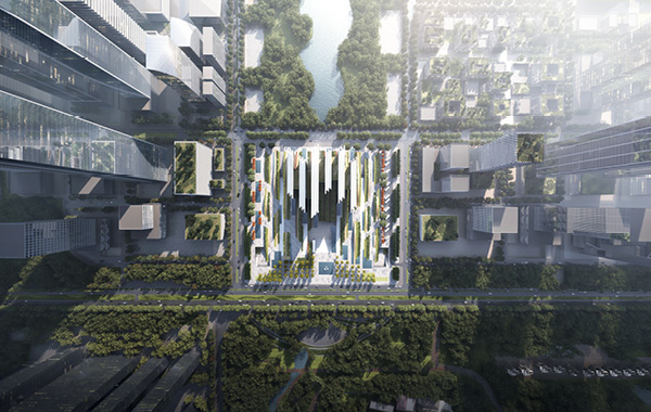
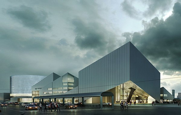
我们的灵感是一艘40年来扬帆破浪、砥砺前行的航船。改革开放展览馆将不仅是一座建筑,也是景观的一部分,更是一个巨型城市雕塑,一组浪涛中的白帆。六只舞动的白帆在景观“浪潮”中迎风挺立,踊跃前行。景观流经建筑,成为建筑物的一部分。参观者可以在流淌的风景中自由漫步。流动起伏的景观既是海洋的隐喻,又象征着改革开放的珠江大潮。微微起伏变化的立面形态,正如波光粼粼的水面,也似迎风舞动的船帆。
基本设计考量
为了突出该项目的独特象征地位,建筑形式应足够抽象,并与景观充分融合。
在该项目中,景观和展览建筑的南北向连续通透的形态将三大公共建筑纳入了“山海景观通廊”的组成部分,以确保视觉和功能上的通达。
为了达到这些主要目标,我们将入口庭院和部分展览空间放在-9m标高楼层。由此以来,则能够通过大小适度但强有力的动态建筑体量,使其他功能空间更加自由有趣。
30米高的公共大厅在巨浪下将展览启幕,丰富的空间体验、动态的景观造型与变幻的自然光影在这里汇聚。
建筑,立面,材料
该建筑具有六个高而窄的建筑体量,隐喻扬起的白帆,迎向波澜壮阔的大海。
六个帆塔的南北两端11米宽的立面,被划分为三个狭窄的“片”。这种”错层式“的垂直划分为“风帆”增加了抽象和动态的特征。 “风帆”的第五立面,即屋顶,也有类似的错层划分。
“风帆”立面的幕墙由垂直的白色陶瓷板条组成。13厘米宽的陶瓷构件(中心到中心间距 40厘米)高225厘米,构件的厚度略有变化,形成了丰富的表皮形态。微微起伏变化的立面形态,正如波光粼粼的水面,也似迎风抖动的帆布。建筑视觉效果随着观看角度的变化而异,时而成为园林中的花格窗棂,时而成为珠江中的片片贝壳。
室内材料采用天然石材、陶瓷、工艺竹等。
展览空间功能布局
访客穿过主广场和入口庭院进入中央公共大厅,再进入常设展览或临时展览以及建筑上部的公共服务功能。-9m层还能通达与地铁和周边两大公共建筑。
超高的公共大厅也可部分作为临时展览的空间。
常设展览位于从-9.0m及+0.0m两层,在+0.0层有13和20米超高展览空间。
类似“手指交叉”的水平/垂直设计,使得一些展览空间享有间接的自然光线。几处休息区享有自然采光及窗外景观。建筑物成为景观的一部分。
-9m标高的第一层展览楼层是一个灵活的无柱空间, 在继续前往+0.0的第二展览层之前,“花园休息区”可提供观展间隙,在观展流线再次到达超高空间前提供平和的自然美景。
超高的展览空间位于第二层展览区,戏剧性的空间起伏结合展品,生动的再现改革开放最辉煌的时刻。不同高度的展览空间覆盖在景观”浪潮“之下。
二层共享平台是中央公共大厅的延申,包含咖啡休息区等公共服务设施。从这里也可继续往上前往专题展区。
结构
我们设计的结构概念基于预制钢结构系统和8m x 11m的基本结构轴网。六个风帆两端包含垂直交通和设备管井的核心筒作为主要的垂直支撑结构。船帆立面表皮内的水平超级钢桁架结构承载在这些结构核心筒上。主展厅的楼板及曲面屋顶是由钢悬杆悬挂在超级桁架之下。因此 -9m层的主要展览区域为无柱灵活空间。
景观
景观“浪潮”主要由高草或竹子种植形成,并沿“波浪”的景观造型起伏。水景元素也是景观的重要组成部分。“风帆”建筑的立面在水景中得以无限延续。景观中的“波浪“高约1到2米,部分更高的”浪涛“之下,是人们遮阳避雨的公共城市空间,包含儿童游玩场所、大巴等候区、公共卫生间、小商店、咖啡茶座、自行车停放区、休憩空间等公共设施,为城市生活提供多样的休闲场景。
景观浪潮在建筑体量之间涌至顶点,成为中央大厅及主展厅的屋顶。绿波潮涌,既是沧海,也是桑田;白帆挺立,既是史书,也是明灯。
这里是一份40年的记录,也将是一个新的起点,等待着人们将更多令人心潮澎湃的故事续写其中。
项目信息
项目名称:深圳改革开放展览馆
项目时间/方案时间:2020年10月 – 2020年12月
项目状态:国际竞赛,在48家申请单位中的15家入围单位之一
项目面积:96,833平米
项目类型:展览建筑综合体
项目客户: 深圳市建筑工务署工程设计管理中心
合作伙伴: 无
项目地点: 深圳
设计团队:Pekka Salminen(主创设计师), 谢方洁(项目建筑师), Martin Lukasczyk(项目建筑师), 李伟(项目经理/芬兰), 彭彦(项目建筑师&景观设计), Gretel Hemgard(景观设计), 赵亦周(建筑师), 赖林莉(项目经理/中国), Jyri Eskola(中国办公室主创设计师), 窦建(建筑师), 林建强(建筑师), 李岳洋(建筑师)
CONCEPT AND ORIGINALITY
Our inspiration has been the metaphor of a ship in full sail at sea on a voyage of 40 years to reach its goal. This concept is not so much a building as it is a part of the landscape. The gigantic urban sculpture in the park glows in the evening like white sails on the wavy sea.
The forms of the undulating landscape overlap six dynamic white sails racing towards victory. The landscape flows through the building, becoming a part of it. Visitors can freely walk around the flowing landscape.
The gently flowing, undulating landscape acts both as a metaphor of the ocean and as a metaphor of the Great Rising Wave of the Pearl River. The gently flowing, undulating landscape acts both as a metaphor of the ocean and as a metaphor of the Great Rising Wave of the Pearl River. The white ceramic facades of the building may evoke the gentle lapping of waves, or sails fluttering in the breeze.
DESIGN PARAMETERS
To highlight the unique symbolic status of this project, the architectural form should be abstract enough and integrate fully with the landscape.
In this project the continuous north-south transparent morphology of the landscape and the exhibition building incorporate the “Triple” project as an integral part of the “mountains and sea corridor” by ensuring visual and functional access to the landscape.
To reach these main goals, we place the entrance courtyard and part of the exhibition space on the sunken level -9. This enables a more free and interesting composition of the other functional spaces with a strong and dynamic, yet moderate architecture.
The 30-meter-high public hall will open the exhibition under the waves, where a wealth of space experience, dynamic landscape styling and changing natural light and shadow converge.
ARCHITECTURE, FAÇADE, MATERIALS
The architecture features six high and narrow building masses, like white sails of different heights, driving the ship forward in the stormy sea.
The 11 meter wide front facades of north and south elevations of six sail buildings, have been divided in three narrow “walls”. This “split-level” vertical division adds abstract and dynamic character to the sails.
The “sails” have the fifth façade seen from the nearby high-rise buildings. That is why also the roof lines have a similar, but horizontal split-level division.
The curtain walls of the “sail” facades feature a vertical white ceramic slats.
The 13 cm wide ceramic profiles, c/c 40 cm, are 225 cm high and depth of the profiles is slightly variable, which forms an interesting surface impression.
To passers-by, the white ceramic facades of the building may evoke the gentle lapping of waves, or sails fluttering in the breeze.
If one pauses to gaze directly at the wall, the ceramic slats might appear to transform into a Chinese window lattice, or of a cluster of Pearl river shells.
The interior materials are of finest quality natural stone, ceramics, technical bamboo etc.
FUNCTIONAL EXHIBITION LAYOUT
Visitors enter the main lobby by passing through the main plaza and the -9 sunken courtyard, then enter the main exhibitions or temporary exhibitions, also to public services in the upper floors. This level also provides connections to the metro and two other galleries of the “Triple”.
Permanent exhibitions are located on two floors starting from -9.0 level, creating an exhibition landscape on the +0.0 ground level with ultra-high, 13 and 20 meters, exhibition spaces.
Due to the “fingers crossed” horizontal/vertical design, some exhibitions spaces enjoy indirect daylight. There are also several rest areas with daylight and a green view. The building becomes a part of the landscape.
The first exhibition level -9 is a flexible, entirely column-free area, which is divided into two large exhibition halls.
Before continuing to the ultra-high second exhibition level at +0.0, visitors can pause to rest and enjoy natural light and a scenic view in the rest lobby.
This second exhibition level contains two halls,telling the brightest moments of the Shenzhen Reform and Opening-up history. The exhibition halls of different heights are covered here by flowing landscape waves.
The balcony level of the entrance hall features a large public lobby with cafeteria, shops etc. This public service level also provides access to the special photo and art exhibitions on the upper floors.
STRUCTURE
The concept is based on a prefabricated steel construction system and basic structural grid of 8m x 11m. The cores for vertical circulation and technical shafts at both ends of the six sails act also as the main vertical support structures. These structural cores support the horizontal steel super-structures along the facades of the sails. The second exhibition floor and the curved landscape waves are suspended from the super trusses. Thus the main exhibition area at -9 level is completely column free and flexible.
LANDSCAPE
The landscape is mainly formed of high grass or bamboo planting, following the undulating heights of the “waves”. The water themes are integrated as an important part of the landscape and its basic typology. The footprints of “sails” have continuation by architectural water scenes as an unlimited extension of façade. The “waves” of the undulating landscape are mainly 1–2 meters high. Some waves are 4 – 6 meters high to give shelter against the rain and the heat of the sun, as well as creating spaces for rest and sitting, a children’s playground, bus waiting, public toilet, small shops, tea house, bicycle shelter or simply peaceful contemplation.
The highest landscape waves are most dramatic between the building blocks, where they form the roof of the exhibition and lobby spaces below. Green waves rise, to form the field and the sea. White sails stand, to become the book of history and the beacon to the future.
SROEH is a record of 40 years history, as well as a beginning of the coming future, for people to highlight it with more and more exciting stories of non-stop reform and opening-up.
Project Information:
Project Name: Shenzhen Reform and Opening-Up Exhibition Hall
Project Time: October,2020 – December,2020
Project Status: International Competition,one of the 15 shortlisted applicants from 48 applicants during open tender; Settled
Project Size: 96,833㎡
Project Type: Exhibition Mixed-use Theatre
Project Client: Engineering Design Management Center of Bureau of Public Works of Shenzhen Municipality
Project Partner: No Partner
Project Location: Shenzhen
Designer Team: Pekka Salminen (Chief Designer), Fangjie Xie (Project Architect), Martin Lukasczyk (Project Architect), Wei Li (Project Manager), Yan Pen (Project Architect and Landscape), Gretel Hemgard (Landscape), Yizhou Zhao (Architect), Linli Lai (Project Manager), Jyri Eskola (Project Manager CI), Jian Dou (Architect), Jianqiang Lin (Architect), Yueyang Li (Architect)
福州海峡文化艺术中心(SCAC)
Fuzhou Strait Culture And Art Centre

无锡大剧院
Wuxi Grand Theatre
图尔库音乐厅
Turku Music Centre
上海潜艇博物馆
Shanghai Submarine Museum
物美科技南方总部
Head Office Project of Wumart South Technology
国际演艺中心
International Performance Centre
深圳改革开放展览馆
Shenzhen Reform and Opening-Up Exhibition Hall
邢台大剧院
Xingtai Grand Theatre
上海九棵树艺术中心
Shanghai Fengxian Forest Theatre
盐文化村落
Yancheng Culture Clustre
扫描二维码分享到微信